


  The homepage is very simplistic that is very image-based. There are links on the left side of the page that connects to the pages as well as the images. On the bottom of the home page, there are footer links to provide another source to navigate the site. All these links, link to their designated page.
I want to make this website image heavy with images linking to its specified page more so than hyperlinking words. Since this site is about food, putting images of food allows the viewer to see what they are about to click. On the Recipe page, I plan to post the recipes in which they will function similar to the homepage. It will consist of the picture of the recipe and link to the recipe.  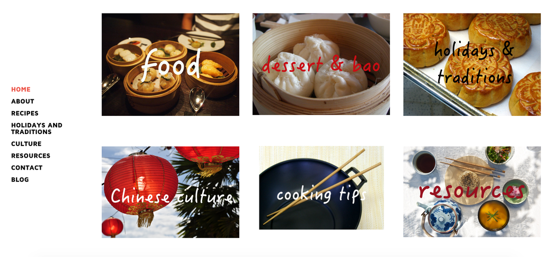  The homepage was designed to be simplistic, open and easy to navigate without too many words. The color of the background is white so that it is not too distracting from the content. This site is about sharing Chinese food recipes, exploring and learning about Chinese culture and food. People would prefer to see more images of food on a recipe website rather than words telling what it is. By making it more image-based, it allows for the image to speak for itself. Along with the links on the left side, the pictures on the homepage link to its designated pages. The font on the logo and on the image links are "fun" and "happy" promoting to "Eat happy." On the image below the logo, the font chosen is more sophisticated to tell what the site is about.
  I chose this theme of the website because I wanted it to be more image-based that feels fun and free to explore. Anybody can visit the site so I wanted it to be easy to navigate where I separated it into 6 sections: food, dessert/bao, holidays & traditions, cooking tips, Chinese culture, and resources. I like how this theme allows for a large header and open space for content. I plan on linking those image icons to its designated page. I also wanted to make this website simplistic with minimal color schemes. The contrasting colors would come from the images of the food.
 My logo captures the essence of having fun with food. The slogan is "eat happy." The mission of my site is to share authentic, homemade Chinese food instead of "stereotyped" or "typical" chinese food. I wanted the color scheme to be happy and fun, so I decided to make the wonton have neutral, light colors. The colors, font and the overall theme of the logo should reflect the feeling of having fun and being happy when eating. Eating should be an enjoyable thing.  |


 RSS Feed
